Building a template.
A template is a one-click starting point for a whole site. This guide walks through building one end-to-end — you design it visually in the Builder, capture what you built as a declarative manifest, register it, and test the install.
What a template is
A template is a one-click starting point for a whole site. When someone installs one, sparx provisions a complete, themed property for them in seconds:
- a brand (name, colors, fonts, logo) and a matching theme,
- a site layout (header, footer, navigation),
- pages (home, about, contact, blog index, product/article templates),
- a catalog (categories, collections, products with options + variants + images),
- content (blog posts, pages),
- emails (welcome, newsletter), and
- optional reusable components.
Everything installs as drafts. The owner reviews it, customizes anything they like, then takes it live. Nothing is published until they say so.
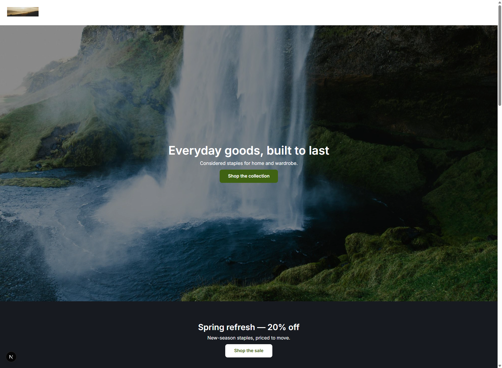
Here’s what one looks like after install and go-live — the flagship Retail Store + Blog template (“Driftwood Supply Co.”):
The big idea: design it visually, then capture it
You don’t hand-write a website from a blank file. The fastest, most reliable way to build a template is to design it in the Builder, then capture the result:
Design it in the Builder
Build it like any normal site — drag sections, set the brand and theme, add a few products and posts. Use a throwaway tenant/property as your scratchpad.
Capture what you built
The page/layout/email trees are the exact JSON the visual editor produces, so you copy them straight into the template. The brand, theme, and catalog are described the same way you set them up.
Assemble the pieces
Collect those pieces into one manifest file.
Register it
Add one line so it shows up in the /marketplace Blueprints category.
Test it
Install onto a scratch property and go live.
The rest of this guide walks each step.
Where a template lives
Each template is one TypeScript file plus a one-line registration:
packages/blueprints/
  src/
    blueprints/
      retail-store-blog.ts     ← the manifest (one file per template)
      <your-template>.ts       ← your new template goes here
    registry.ts                ← register it here (one line)
    manifest.ts                ← the schema every template is validated against
    refs.ts                    ← the $asset helper for images inside content
The manifest is declarative data — no code runs at install time, which keeps the marketplace safe. It’s plain TypeScript objects validated by Zod, so a typo or a bad reference fails the moment the file loads, not in production.
Anatomy of a manifest
A manifest is one big object. Here’s the skeleton with every top-level field; we’ll fill each in below.
const manifest = {
  key: 'retail-store-blog',          // stable id, lowercase-with-hyphens
  version: '0.1.0',                  // semver
  name: 'Retail Store + Blog',       // shown on the card
  summary: 'A clean DTC storefront with a small catalog and a journal…',
  vertical: 'retail',                // retail | b2b | content | services
  preview: '/blueprint-previews/retail-store-blog.png',
  requiresModules: ['builder', 'commerce', 'cms', 'email'],

  brand:    { /* identity: name, colors, fonts, logo */ },
  theme:    { /* the named theme this template ships */ },
  assets:   [ /* every image, declared once and referenced by id */ ],

  contentTypes: [],                  // custom content types (usually none)
  content:  [ /* blog posts, pages */ ],

  commerce: { categories, collections, products },

  components: [ /* reusable tenant components (optional) */ ],
  layout:   { /* site chrome: header · Outlet · footer */ },
  pages:    [ /* home, blog index, and templates for each record type */ ],
  emails:   [ /* welcome, newsletter, … */ ],
};

export const retailStoreBlog: Blueprint = parseBlueprint(manifest);
parseBlueprint(manifest) validates the whole thing (including cross-references, e.g. every categoryHandles points at a real category) and applies defaults. If you got something wrong, the package won’t build — that’s the safety net.
Identity fields
| Field | What it is |
|---|---|
key | Stable, unique id. Lowercase, hyphens. Never change it after release. |
version | Semver. Bump it when you change the template. |
name / summary | The title and one-paragraph pitch on the marketplace card. |
vertical | One of retail, b2b, content, services. Drives grouping/filtering. |
preview | A screenshot of the installed site (see Preview image). |
requiresModules | The modules the template needs. A tenant missing one is prompted to enable it. Options: builder, commerce, cms, crm, email, b2b, dropship, ai. |
Brand
The brand is the tenant’s identity. Colors are #RRGGBB. Fonts are family names. The logo references an asset by id (see Assets).
brand: {
  businessName: 'Driftwood Supply Co.',
  tagline: 'Everyday goods, built to last.',
  colors: {
    primary: '#3F6212',
    primaryForeground: '#FFFFFF',
    accent: '#B45309',
    secondary: '#1C1917',
  },
  fonts: { heading: 'Fraunces', body: 'Inter' },
  logoLightAssetId: 'logo',          // an id from `assets`
},Theme
A template ships its own named theme. It layers a brand “look” over one of the built-in presets, so a single setting themes the entire stack — site and emails. Pick a basePresetKey whose personality fits, then override the brand tokens.
theme: {
  name: 'Driftwood',
  basePresetKey: 'market',           // see "Theme presets" below
  presentation: { v: 2, containerWidth: '1200px' },
  brand: {
    colorPrimary: '#3F6212',
    colorPrimaryForeground: '#FFFFFF',
    colorAccent: '#B45309',
    fontHeading: 'Fraunces',
    fontBody: 'Inter',
    tokens: { radiusBase: '8px' },
  },
  apply: true,                       // make it the working theme on install
},
Theme presets (basePresetKey): apex, industrial, drift, market, fleet, drop. Choose the one whose density/personality is closest to your design, then let the brand look recolor it.
Assets
Every image is declared once with an absolute URL and referenced everywhere by its short id. Today images hot-link the URL (fast path); a later release copies them into tenant media.
assets: [
  { id: 'logo',      url: 'https://…/logo.png',  alt: 'Driftwood Supply Co.' },
  { id: 'tee-front', url: 'https://…/tee.jpg',   alt: 'Classic tee, front' },
  { id: 'blog-1-img',url: 'https://…/work.jpg',  alt: 'Raw materials on a workbench' },
],
For placeholders while you design, https://picsum.photos/seed/<seed>/<w>/<h> gives stable, deterministic images. Swap them for the real photos before release. You reference an asset two ways:
- From structured fields (logo, product image, category hero, OG image): a
*AssetIdfield, e.g.logoLightAssetId: ‘logo’. - From inside a content body (a rich field that holds an image): the
assetRef()helper, which produces a{ $asset: 'id' }marker (see Content).
Content
Most templates use the built-in content types — page and blog_post — so you don’t define any custom types (contentTypes: []). Each entry names its typeKey, an optional slug, and a body validated against that type’s schema. Entries default to draft.
content: [
  {
    typeKey: 'blog_post',
    slug: 'made-to-last',
    body: {
      title: 'Made to last',
      excerpt: 'Why we obsess over materials — and what "durable" really means.',
      body: doc(
        'Durability is a series of small decisions: the weight of a fabric…',
        'We start every product from the material up…'
      ),
      featuredImage: assetRef('blog-1-img'),   // image inside a content body
    },
  },
  {
    typeKey: 'page',
    slug: 'about',
    body: {
      title: 'About Driftwood',
      excerpt: 'A small shop for well-made everyday goods.',
      body: doc('Driftwood Supply Co. started with a simple idea…'),
    },
  },
],
doc(...) is a tiny helper that turns plain paragraphs into the rich-text document the editor stores. assetRef(‘blog-1-img’) links the declared asset into the body.
Commerce
Three lists: categories, collections, and products. Everything links by handle (a stable slug), never by id — the manifest can’t know runtime ids.
commerce: {
  categories: [
    { handle: 'apparel', name: 'Apparel', position: 0, featured: true },
    { handle: 'tops', name: 'Tops & Tees', parentHandle: 'apparel', heroAssetId: 'cat-tops-hero' },
  ],
  collections: [
    { handle: 'featured', name: 'Featured', type: 'manual', featured: true,
      productHandles: ['classic-tee', 'denim-jacket', 'wool-beanie'] },
  ],
  products: [ /* see below */ ],
},
A product with options and variants. Important ordering rule: a product’s options define the lattice (Color × Size); each variant then maps onto it via optionValues. Prices are in cents.
{
  handle: 'classic-tee',
  title: 'Classic Tee',
  description: '<p>A midweight everyday tee in soft combed cotton.</p>', // HTML allowed
  productType: 'Apparel',
  vendor: 'Driftwood',
  tags: ['tee', 'staple'],
  categoryHandles: ['tops'],
  collectionHandles: ['featured'],
  options: [
    { name: 'Color', displayType: 'swatch', position: 0, values: [
      { value: 'Black', swatchHex: '#1C1917', position: 0 },
      { value: 'White', swatchHex: '#FFFFFF', position: 1 },
    ]},
    { name: 'Size', displayType: 'segmented', position: 1, values: [
      { value: 'S', position: 0 }, { value: 'M', position: 1 },
    ]},
  ],
  variants: [
    { sku: 'TEE-BLK-S', optionValues: { Color: 'Black', Size: 'S' }, priceCents: 2400, isDefault: true },
    { sku: 'TEE-BLK-M', optionValues: { Color: 'Black', Size: 'M' }, priceCents: 2400 },
    { sku: 'TEE-WHT-S', optionValues: { Color: 'White', Size: 'S' }, priceCents: 2400 },
    { sku: 'TEE-WHT-M', optionValues: { Color: 'White', Size: 'M' }, priceCents: 2400 },
  ],
  images: [
    { assetId: 'tee-front', isPrimary: true, position: 0 },
    { assetId: 'tee-black', optionValues: { Color: 'Black' }, position: 1 }, // shows when Color=Black
    { assetId: 'tee-white', optionValues: { Color: 'White' }, position: 2 },
  ],
},
A simple product (no options) just needs one default variant:
{
  handle: 'wool-beanie',
  title: 'Wool Beanie',
  description: '<p>A warm ribbed beanie in a soft merino blend.</p>',
  categoryHandles: ['accessories'],
  variants: [{ sku: 'BEANIE-CHR', priceCents: 2800, isDefault: true }],
  images: [{ assetId: 'beanie-img', isPrimary: true }],
},Authoring trees
A page, a layout, an email, and a component are all the same thing: a node tree. This is the heart of the work.
The node model
Every node — whether it’s a section that arranges children or a leaf that renders content — has the same shape:
{
  id,                  // unique within the tree
  type,                // what it IS: 'Section', 'Heading', 'ImageDisplay', …
  box,                 // the universal spine: spacing, surface, width, background
  layout?,             // containers only: direction, columns, gap, alignment
  props,               // component-specific: heading level, button label, …
  binding?,            // bind to data (a field, or an array to iterate)
  children?,           // for containers
}
Rather than write that by hand, every manifest uses a tiny node() helper (copy it from retail-store-blog.ts). It fills in defaults so you only state what differs:
node('Heading', { props: { level: 'h1', text: 'Everyday goods, built to last' } })

node('Section', {
  box: { surface: 'subtle', padding: 'lg', contentWidth: 'contained' },
  layout: { direction: 'stack', gap: 'md' },
  children: [ /* … */ ],
})The box (every node has one)
| Axis | Values | Notes |
|---|---|---|
height | auto sm md lg full | Section height. |
backgroundWidth | full contained | Does the background span edge-to-edge or sit in the container? |
contentWidth | full contained | Does the content stretch or stay in the readable column? |
surface | none subtle muted inverse brand | A token-paired background + foreground. |
padding | none sm md lg xl | |
align | start center end | Horizontal alignment of content. |
backgroundImage | URL | Full-bleed photo behind the node. |
overlay | none dark light gradient | A scrim over the background image so text stays legible. |
textTone | default light dark | Text color over a photo, independent of surface. |
pin | none top | top floats a header over the hero beneath it. |
A full-bleed photo hero is just a section with a background image, a dark overlay, and light text:
node('Section', {
  box: {
    name: 'Hero', height: 'lg', backgroundWidth: 'full', contentWidth: 'contained',
    align: 'center', padding: 'xl',
    backgroundImage: 'https://…/hero.jpg', overlay: 'dark', textTone: 'light',
  },
  layout: { direction: 'stack', gap: 'sm', justify: 'center', alignItems: 'center' },
  children: [
    node('Heading', { props: { level: 'h1', text: 'Everyday goods, built to last' } }),
    node('Text', { props: { variant: 'body', text: 'Considered staples for home and wardrobe.' } }),
    node('Button', { props: { label: 'Shop the collection', style: 'primary', href: '/collections/featured' } }),
  ],
}),The layout (containers only)
| Axis | Values |
|---|---|
direction | stack (vertical) · row (horizontal) · grid |
columns | 1–12 (grid only) |
gap | none sm md lg |
justify | start center end between |
alignItems | start center end stretch |
Node types you’ll use
Containers: Section, Grid, Card, Stack, Carousel, and Outlet (the placeholder in a layout where the page renders).
Leaves: Heading, Text, Prose (rich text), Button, Badge, Icon, Divider, ImageDisplay, Video, Map, Stat, FAQ, FeatureGrid, EditorialSection, Logo, NavMenu, SocialLinks, Signup (newsletter).
Commerce leaves (on a product page): PriceTag, BuyBox, VariantPicker, Quantity, AddToCart, ProductForm.
Binding: static vs. data-driven
A leaf is either static (you give it text) or bound to a field. A container bound to an array iterates — it renders its children once per item, and inside, item.* refers to the current record. This is how a product grid or a blog list works:
node('Grid', {
  layout: { direction: 'grid', columns: 3, gap: 'lg' },
  bind: 'commerce.product',                    // ← iterate over products
  children: [
    node('Card', {
      layout: { direction: 'stack', gap: 'sm' },
      children: [
        node('ImageDisplay', { props: { ratio: 'square' }, bind: 'item.images' }),
        node('Heading', { props: { level: 'h3' }, bind: 'item.title' }),
        node('PriceTag', { bind: 'item.price' }),
        node('Button', { props: { label: 'View', style: 'soft' } }),
      ],
    }),
  ],
}),
On a collection page (a per-record template), the record itself is in scope — bind to product.title, blog_post.body, page.body, etc. Because text and styling come from tokens and the theme, the same tree re-themes automatically for whatever brand installs it. That’s why you author once and it looks right for everyone.
The site layout
The layout is the chrome around every page: a header, the Outlet (where the page slots in), and a footer.
node('Section', {                                  // root
  layout: { direction: 'stack', gap: 'none' },
  children: [
    node('Section', {                              // header
      layout: { direction: 'row', justify: 'between', alignItems: 'center' },
      children: [
        node('Logo', { bind: 'site.identity' }),
        node('NavMenu', { props: { orientation: 'row' }, bind: 'site.primaryNav' }),
      ],
    }),
    node('Outlet'),                                // ← the page renders here
    node('Section', {                              // footer
      children: [
        node('NavMenu', { props: { orientation: 'row' }, bind: 'site.footerNav' }),
        node('SocialLinks', { bind: 'site.social' }),
        node('Text', { props: { variant: 'meta', text: '© Your Shop' } }),
      ],
    }),
  ],
})Pages: singletons vs. collections
pages: [
  // The HOME page = a singleton with NO slug. It serves at "/".
  { name: 'Home', kind: 'singleton', tree: homeTree(), seoTitle: 'Driftwood Supply Co.' },

  // Another singleton at a fixed route.
  { name: 'Journal', kind: 'singleton', slug: 'blog', tree: blogIndexTree() },

  // Collection pages = the template for every record of a type.
  { name: 'Blog post',    kind: 'collection', recordType: 'cms.blog_post',    isDefault: true, tree: blogPostTree() },
  { name: 'Product page', kind: 'collection', recordType: 'commerce.product', isDefault: true, tree: productTree() },
  { name: 'Page',         kind: 'collection', recordType: 'cms.page',         isDefault: true, tree: pageTemplateTree() },
],/. Don’t give it a slug.Emails
Emails are trees too, just simpler (one column, no layout chrome). They install as drafts.
emails: [
  {
    name: 'Welcome',
    subject: 'Welcome to Driftwood 👋',
    preheader: "You're in — here's what we're about.",
    tree: node('Section', {
      layout: { direction: 'stack', gap: 'md' },
      children: [
        node('Heading', { props: { level: 'h1', text: 'Welcome to Driftwood 👋' } }),
        node('Text', { props: { variant: 'body', text: "Thanks for joining…" } }),
        node('Button', { props: { label: 'Shop new arrivals', href: '' } }),
      ],
    }),
  },
],Reusable components (optional)
A component is a parameterized tree you can drop onto pages. Its tree uses { $prop: 'key' } slots; the page placement fills them in via a custom:<key> node.
// In components:
{
  key: 'promo_banner', name: 'Promo banner', group: 'content', icon: 'megaphone',
  surfaces: ['page'],
  tree: node('Section', {
    box: { surface: 'inverse', padding: 'xl', align: 'center' },
    layout: { direction: 'stack', gap: 'sm', alignItems: 'center' },
    children: [
      node('Heading', { props: { level: 'h2', text: { $prop: 'heading' } } }),
      node('Button', { props: { label: { $prop: 'buttonLabel' }, href: { $prop: 'buttonHref' } } }),
    ],
  }),
  propSpec: [
    { key: 'heading', label: 'Heading', kind: 'text', default: 'Big news' },
    { key: 'buttonLabel', label: 'Button label', kind: 'text', default: 'Learn more' },
    { key: 'buttonHref', label: 'Button link', kind: 'url' },
  ],
}

// On a page (note customType + the version pin):
node(customType('promo_banner'), {
  props: { $ref: { version: 1 }, heading: 'Spring refresh — 20% off', buttonLabel: 'Shop the sale', buttonHref: '/collections/featured' },
}),Preview image
The marketplace card shows a screenshot of the installed site. Capture one after you go live, then:
- Save it to
apps/dashboard/public/blueprint-previews/<key>.png. - Point the manifest at it:
preview: ‘/blueprint-previews/<key>.png’.
Aim for a clean shot of the home page (the card crops to 16:10, top-aligned).
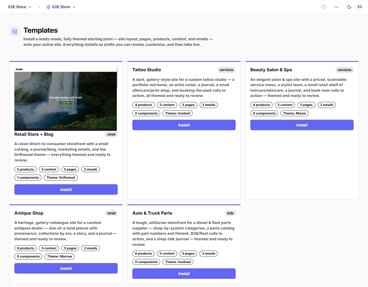
Register it
Add your template to the catalog so the /marketplace Blueprints category picks it up:
// packages/blueprints/src/registry.ts
import { retailStoreBlog } from './blueprints/retail-store-blog';
import { yourTemplate }    from './blueprints/your-template';   // ← add

export const BLUEPRINTS = {
  [retailStoreBlog.key]: retailStoreBlog,
  [yourTemplate.key]:    yourTemplate,                          // ← add
};
That’s it — the /marketplace Blueprints category, the install API, and the marketplace all read from this registry.
Test it
It validates on build
parseBlueprint() runs when the module loads, so pnpm --filter @sparx/blueprints typecheck and the package tests catch a malformed manifest, a dangling handle, or a missing asset id immediately.
Install onto a scratch property
From the dashboard, switch the active site to a throwaway property, open Templates, and click Install. Everything lands as drafts.
Review the drafts
Walk the pages in the Builder, the products in Commerce, the posts in CMS, the emails in Email. Fix anything that looks off in the manifest and re-test.
Go live
Click Go live — it publishes every page, activates the layout, sets products live, and publishes content. Open the site and confirm it renders.
Conventions & gotchas
A few rules that aren’t obvious but will bite you:
- No eyebrows. Never put a small uppercase/mono kicker label above a heading. Carry hierarchy with size, weight, and color. (Platform-wide — see the brand guide.)
- Say “Site,” not “Storefront” in any user-facing copy. (Code identifiers can keep “storefront.”)
- Product options come before variants. Define the option lattice, then map each variant onto it with
optionValues. A variant that names an option/value you didn’t declare fails validation. - Prices are integer cents (
priceCents: 2400= $24.00). - Reference by handle/id, never by UUID. The manifest can’t know runtime ids; the installer resolves handles as it goes.
- The home page is a slugless singleton. Don’t give it a slug.
- Images hot-link for now. Declare them in
assets; reference by id. (A future release copies them into tenant media.) - Installs land on the active property. On a secondary (non-primary) site, the brand applies as that site’s override — it won’t repaint the primary site.
- Everything installs as a draft. Go-live is a deliberate, separate step.
Quick reference
- Verticals:
retail·b2b·content·services - Modules:
builder·commerce·cms·crm·email·b2b·dropship·ai - Theme presets:
apex·industrial·drift·market·fleet·drop - Surfaces:
none·subtle·muted·inverse·brand - Spacing / padding / gap:
none·sm·md·lg(·xlfor padding) - Built-in content types:
page·blog_post - Record types for collection pages:
commerce.product·cms.blog_post·cms.page
For the full schema, read packages/blueprints/src/manifest.ts. For a complete worked example, read packages/blueprints/src/blueprints/retail-store-blog.ts.